Monday, 25 April 2016

Project Post Mortem

I did it! I've completed my Honours year final animation. Its been a great journey to complete this animation and I'm proud that I managed to get it finished in time. There's a lot to talk about so this blog post will be dedicated to evaluating the animation, picking apart the different elements and talking about them. It will be a very large post in comparison to the rest so I've split it into various sections and added pictures and bold words to hopefully keep things interesting.


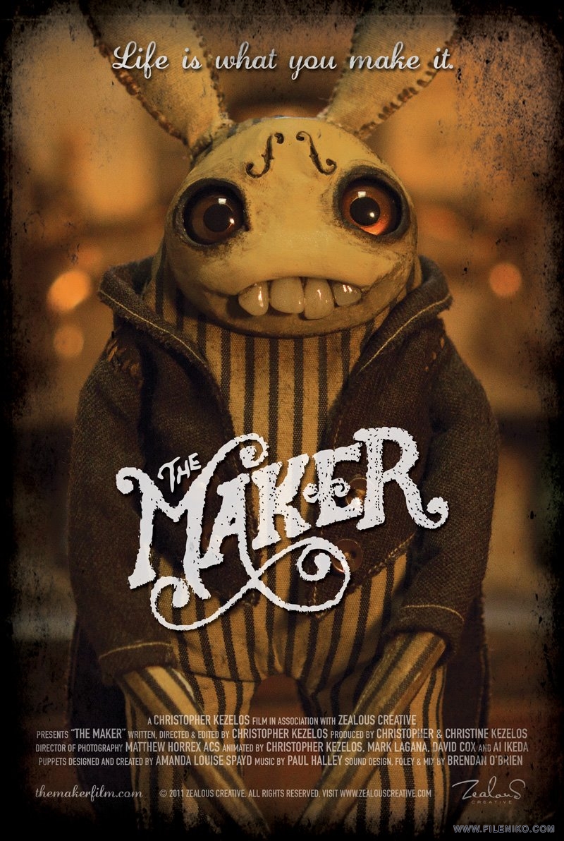
To summarise, the animation centres around a stop motion armature who after being built, comes to life. The character seems curious about their surroundings and tries to figure out how to move around. He stumbles on to a pile of clay and begins to explore how the clay works. He then attempts to build himself a body which doesn't quite work out.

The whole process from initial idea to completion was carried out in semester two (January - April) of this year. The concept and story design took longer than anticipated and an additional project left filming to the last four weeks. Upon looking back, I would've certainly liked to have started filming earlier but I think that's how all of my post mortems go. Sometimes mulling about in pre-production is how the final project is formed. To have started filming earlier I may not have learnt key lessons or developed ideas which led to the current incarnation of my animation. My work ethic has also improved throughout this semester, starting with making attempts to rejuvenate my YouTube channel. Without that, I wouldn't be in the same position I am now.

Plot/Concept

Storytelling is not my strong point. While being an animator and a storyteller go hand in hand, I always feel I fall short when it comes to creating a story. I usually come up with sound concepts, but struggle with making a final point or closing it all off. My strengths in coming up with stories mostly revolves around comedy, in particular silly jokes and slapstick gags. I've attempted to write more serious stories during my time at university but haven't done too well. I don't do well in writing serious stories because I find them boring to write, so that's why this project's story was more humorous, because I enjoy humour and therefore write it better. I'm more than willing to animate something serious but would prefer working with a writer who is better at writing something more serious and has more enjoyment in coming up with emotions and morals, etc.

Visual gags are what I can do so that's what I did. While I made attempts to have a story that has a pay off and a structured plot, the narrative is still something I can spend time working on. I love to animate, bring things to life and make magic happen with every day objects and there is no way to do that without a story. Every animated action is a story, it tells us what the character's motivation is.

While the project's concept is sound, the execution of the story was satisfactory. The character's actions and the events that happen in the animation all help to tell the story of what is going on and how the character is thinking. Building from the animatic, I added additional actions where necessary to draw out moments and build on the character's personality.

Animation Evaluation

The animation itself, is something I am pretty proud of. While it's not my most consistent quality of work, there are some moments I animated very well and I feel I did pretty good overall considering this was my first attempt at animating with an armature and a larger set within a larger animated short film.

I was concerned at first that animating with the armature would be challenging. I anticipated I would have a different experience with animating in this way and I knew the only way to learn was to have a go at it. I created a short test animation with the armature but only once I was animating the final outcome did I get a chance to really get to know the armature. I'm not sure if anyone will notice but myself, but my confidence with using the armature can be visible throughout the animation as I overcome both technical and creative obstacles. The quality of animation does improve as the animation plays with some slight faltering towards the very end of the animation.

It became very clear that the more time and care I spent in an animated action, the better it would come out. Obviously I would have loved to have spent more time in every shot however sometimes that's just not possible. With each animation I make I become more aware of how much time I need to spend creating a shot in order to achieve the best result. My limited time frame to complete the animation left some of the later shots to be animated under pressure. And sometimes, you just have a bad day or you cant get in the animation mood so the animation quality isn't as strong. And sometimes its just down to luck, sometimes you choose to move the character a certain distance and it turns out to be the perfect distance for the timing you want.

The straight ahead nature of stop motion has its benefits but also its drawbacks, Unlike other animation mediums, there are few options to go back and correct something. Either you can go back a few frames and re-shoot or re-do the entire shot. Sometimes you can get lucky and reposition the character and slot a frame or two in an already shot action but that requires very good accuracy. I've managed to slot in frames before with my Lego animations but that is easier when the character's have a limited degree of movement and exist on a grid. The aluminium armature has so many degrees of motion that trying to reposition it to an earlier pose precisely is extremely difficult. Because of this, you have to think about your timing, poses and movements between each frame as you go along. You can't make corrections or fix things in a graph editor so it is a challenge.

However this can lead to more organic looking animations and even the imperfections of not quite getting a frame shot correctly can leave the animation with a unique charm to it. This encapsulates a lot of what my project is about, embracing the imperfections of the animation - because you pretty much have to.

First Moments (0:12 - 0:24)

Looking back, I can see that the first few actions that the character does are not as good as the rest of the animation. The timing is a little bit off in places so the quality of movement isn't as consistent. I did anticipate this as I know that it can often take me a little bit of time to get comfortable with a new material or character.

The Stumble (0:32 - 0:35)

This part of the animation took a long time to create but I am particularly proud of it. I was originally going to have the character fall into a stumble from standing up where he'd be unable to catch his balance. I altered the narrative to where the the character does catch his balance and tests his footing. On the second footing test he falls into a stumble and into a pile of clay.

It was a technically impressive shot for my standards requiring multiple supports that needed to be masked out, in addition to camera movement. Despite that the timing for the stumble and the action itself turned out pretty good and there's a good sense of gravity and momentum to it. I could have eased into the stumble a little better by adding in additional uncertain movement. 


Character Moments (0:36 - 0:57)

I added a lot of unscripted actions in here. This was the idea from the start that due to the straight ahead process of stop motion animation, I'd likely add more actions in as I get to know the character and understand what they'll want to do next. I added in a couple of gags such as the clay on the face and playing with the clay which frequently falls off.

These character moments helped to add interest to the narrative and make the character more interesting to watch. By having him explore with the clay and its properties it gave me the opportunity to both show off the different movement qualities of the clay and also slow down and help pace the story better.


Clay Moulding (0:58 - 1:13)

Working with clay during January's Game Jam, I had a good idea of the potential of clay's metamorphic qualities. This section of the animation allowed me to explore that as the character attempts to build himself a body. I allow both the character and myself to mould the clay into shape. The character moves and moulds the clay however being the animator I also have to mould the clay to get it into the shape I want, even with superb animation you can't match the movements of the character to the clay perfectly.


Tension/Force (1:20 - 1:27)

A challenge for a lot of animators is getting an adequate representation of force in an action. Fortunately for stop motion, you get a helping hand with working with real world objects. The clay allowed me to lock the feet in place and it provided enough tension that the more I moved the character the more the clay tried to pull the character back in place. In order to create the idea that the character was applying force to free himself from the clay I added movements such as anticipation into the force as well as adding arm movements to signify a struggle. 

I think this part of the animation I did pretty well, the character successfully appears to be struggling against the clay and I think it gets the story point across well.With more care I could remove frames to create a greater tug or greater recoil.

Final Fall (1:28 - 1:30)

This shot was filmed in the last week before hand-ins so I do feel it was a bit rushed. Even with more time throughout the semester I think I would have inevitably felt pressure while animating the ending because I tend to postpone the ending in order to make the most out of the middle of the animation that I can.

The action and movements overall are pretty good but the timing is a little off during the middle of the tumble. This is partly down to time pressure but also not spending enough time considering staging. I realised part-way into the camera movement that the character was moving faster than the camera movements so I began moving the camera more to compensate. In addition, I didn't realise how long the set was so to have the character reach the other end of the screen I could have added even more struggling and build to an even greater moment where he breaks free.

Sound Design

I feel sorry for people working in sound design sometimes because sound is often what animators and game developers leave too late and shove on at the end. I won't lie that this is what I did, but as a project that focuses on specifically the quality of animation movement and the materials in stop motion animation, the sound isn't what my project is all about. Throughout the year in my numerous animation tests and experiments, I haven't included sound effects or music in them. While I could have gotten away with leaving out sound from my final animation, even average sound effects thrown together in a short amount of time can go a long way.

I stuck with realistic sounds for the most part, utilising my own sound library I've built up throughout the years and the glorious amount of free sound effects online. I took care into finding sounds with a similar audio quality and made sure to balance out volumes so nothing was jarring or seemed out of place.

The types of sounds I looked for were things that matched the material. For sound of the armature, metal bending and creaking helped to draw attention to the character's material and what is is physically made of. Unlike most other animations, the concept of this animation is that the materials are a big focus and that realistic sounding materials coming to life helps that illusion.

To contradict what I just said, the sound of the clay is exaggerated as the actual sound it makes is basically nothing. I still kept a sense of realism the same way I chose to animate the clay, by exaggerating its fluidity but still keeping a sense of appearing as clay. There is a squishy but also chunky sound which I think helped to build a better picture of the appearance I wanted the clay to take.

Not every action had sound to it, I could have spent a lot more time adding sound to every movement and interaction. I limited the sound I added for both not being able to find a satisfactory sound to match what I wanted and also not wanting to overload the animation with sound effects.

Observations

There were assumptions made before going in to this animation, assumptions made through the literature and animation research and also from previous practical work. I made assumptions as to how I might move and deform the clay or assumed the limitations and possibilities of the armature.

However there were other qualities that I discovered through a hands-on approach practical work and I was able to tie these discoveries in to my research and dissertation.

Animator/Character Relationship

Just before I started filming I was looking at older animations where an animation would feature the animator in the same film as the character he was animating. I discussed Out of the Inkwell among other animations which feature the interaction.

I added pixilation in the beginning of the animation to set up the idea that the character was inanimate before becoming alive. It was both to set-up the premise and also give a subtle nod to the animations I had looked at. I had also considered adding a pixilation scene to the end of the animation where the animator would reappear and help out the armature by giving him some pre-made clothes.

As I approached the end of the animation I realised I had to cut the ending short for timing. The character would simply fall into a bunch of set pieces and discovered some pre-made clothes. However as I was filming this scene at the time I had a spur-of-the-moment idea to re-introduce the animator to hand over a pre-made body part to the armature which would cheer him up. I made it really cheesy and literally gave the character "a hand". It wasn't planned ahead but I liked it and I'm glad I worked it in as it both works as a charming ending and ties the whole thing together. It both wraps the story up and also my process on coming up with the story in the first place.

Challenges

I've discussed a few challenges I've faced already. This section covers some challenges I haven't yet mentioned. One thing that stop motion animation requires is good planning and staging. In other animation mediums if you decide you want to add in additional objects you can. In stop motion you are locked in to the way your set looks from the very beginning. This is why I would have loved to have worked more on the set design but had to begin animating and therefore could only do so much for the set.

As I animated away sometimes I would regret positioning something in such a way or wished I could change things. Some things I could change like adding more support to a background to keep it in place or making subtle changes in the layout of the set between camera changes. Like a lot of animations there are opportunities to reuse assets or shift the layout or perspective of the set to make things work, I did this here and there but not as often as I usually do due to the longer shots and reliance on one set.

Moving Forward

I feel like I am in a stronger position than I was at the start of the year and its pretty amazing what I've managed to achieve this year in comparison to previous years. The project has definitely changed the way I look at my own animations as I make efforts to think about the techniques and qualities I've researched and explored. My future animations will be better for it.

I look forward to the upcoming Graduate Show where I will no doubt get a lot of comments from many different people. I imagine the feedback I get will be much more specific and useful than what I'd get from YouTube comments so it will be a new experience to see how industry professionals and others view my work. The nature of presenting the work in a physical display will also be new to see how people interact with the work.

This is the last blog post included in the submission for the Honours Project portfolio submission. Any post beyond this point will not be included in the submission but will be focusing more on preparing for the Abertay Digital Graduate show.

Apologies for the length of this post and my tendency to ramble. I hope it was worth your time reading and maybe it helps to understand my thoughts on my project. 

Poster Ideas

A requirement for the Abertay Digital Graduate Show is to create and display an A2 poster that encapsulates and represents the work so that people can get an idea what you've created before they take a deeper look at the actual work and the research that was undertaken.

I've chosen to create a movie-style poster to tell people that my work is a movie (a short one) featuring an armature character. To me, the main things that tell me a poster is about a movie is the layout of the title and text including the credits. I'll use the credits text to credit myself as well as include links to my website and social media channels. There will also be room for a gag or two, I will want to fill in the space so that from afar it looks like a fully cast movie production.


These sketches show what I am thinking about making. I took inspiration from posters I'd already researched, in particular featuring the character with a non-detailed background. I considered using a frame from the animation but decided it'd be beneficial to replicate it by re-composing a stronger pose and allowing myself to achieve better lighting and image quality by doing this. I'll either replicate a frame from my animation or be creative and create a scene that represents my animation but might not be a direct scene from the animation.

I want to utilise and represent the texture that comes from stop motion, I'll do this by utilising the background noise that is present through taking a photograph and will try to capture as much as I can through the photograph before altering it digitally. For the background I want it to be mostly dark, to emulate the style of poster The Lego Movie has (as seen in my previous blog post) or how the Minions promo material often have them appear in a white void. After meeting with Lynn earlier today she suggested maybe using a cardboard or clay texture that repeats and forms the background of the poster, similar to the process in making graphics for my team's Global Game Jam game.

I've began layout this out digitally and will work on this further during the week. Similar to the way I created the business cards, I will create some draft ideas that I can get feedback on. Hopefully I can get this sent away by the end of the week to ensure it will arrive in time for the graduate show.

Friday, 22 April 2016

Progress Update - Final Stretch

We're now into the final week of animation before the submission of the Honours portfolio on Monday. 

I met with Lynn this week to show my progress and feedback was positive. My animation still goes too fast in some places but slowing down and adding additional character actions has benefited the story and added more depth to the character.

I still have the weekend ahead of me to film the rest  but I have made some progress since the last update blog. While I've spent the last few days focusing on my dissertation and additional work for the graduate show, I've animated the character begin to form their body.


Editing

I've been using Stop Motion Pro 7.5 Studio HD to capture frames for the project so far. I've had the software for a couple of years and it has a number of useful features such as onion skinning and frame blending (taking multiple pictures at once for one frame) to reduce visual noise. One thing I've never managed to use well is its editor. Its difficult to add frames and move them around and if you save a clip as an AVI, its a nuisance to go back and edit once its saved out and laid in an editor. For those reasons I use Sony Vegas Pro 11.0 to lay out all the frames where I can extend, add and remove them to my liking.

I've set Sony Vegas to automatically set images to 0.07 seconds long which is 1 frame at 15fps (frames per second). However I also have the project settings set to 30fps so that allows me to not be constrained to 15ps, I can double frames up to work on twos or extend a frame by a half. I prefer this level of flexibility so that I am able to fine tune timings if necessary. Its important that I don't mess around with frame rates too often as this can be jarring or look out of place. 


Similar to how I approached my Lego Batman v Superman Trailer video, I've laid out my animatic underneath so that I can compare my captured animation to the animatic at any time. It also benefits me for scheduling and working out the pace in which I can film shots by having a visual representation of what I have left to do. Both in the Lego Batman v Superman video and this project, I've managed to become very good at scheduling my time when it comes to animation. My time management everywhere else is still mixed.

Audio

I've began to source sound effects and will record my own voice to add to the character. The animation will still be unspoken but reaction noises will help to give the character a bit of life. The sounds I'll be adding will be comical in nature to match the tone of the animation and provide an additional layer of interest to the animation.

I haven't yet decided on a musical track. I will add one if I come across the right track but won't force one in if I'm not happy with it. If I were to add music it'd be upbeat and not too strong. Something classical or calm would allow the visual storytelling to be the main focus.

Thursday, 21 April 2016

Creating a Business Card

As part of the digital graduate show and general professional practice I am in need of a new business card. My previous business cards have been nothing special but I've never needed them for actual business purposes, they were mostly a simple way to give someone the link to my YouTube channel.

For reference this is the business card design I created in 1st year Dynamic Communication. In my first year of university I was overwhelmed with new ways of thinking and new skills to learn. As such, the designs I created were nothing special. For this module I also created a logo which I still use today. The logo is still okay but I feel it may need a revision in the near future.

I never actually printed these designs out to use so the last business card I actually had in hand was designed back in Secondary School and was pretty basic. Below is a scan of it since there was never a digital file it existed in.


Although for the Digital Graduate Show, I want my business card to represent me and the work I create on a whole, hence using my "blobstudios" branding quite heavily. Through thinking about my new website design, I want each thing to match well with the other. I primarily use a dark grey or black, reds and whites throughout my brand so I wanted to continue that here. I had an idea about using a Lego style stud grid as a background.

The most important information I have to include is my name, website and email. My YouTube link is also pretty important and I may also want to include my phone number and Twitter handle (which is one of the easiest ways to get in contact with me, its one of the few social networks other than YouTube which I actively post on). I also considered my LinkedIn page but that may overload the card with information. If anyone desperately wants my LinkedIn it'll be linked on my website.


This is the first draft that I've created based on my doodles. I really like the colours used and I think a darker background is a nice change from the white backgrounds I've used before. My intention was to use the stud grid background on the back of the card and I wasn't entirely sure what to have on the front. Having the background on both ties the two sides together. I initially had the background with greater contrast but it didn't look too great when text was put in front.

The card designs here include a trim area so the design will be cropped on all sides when it is printed.


I think the back of the card is passable on its own however I will want to try out different layouts on the front of the card to make better use of the space. There are other things I will want to consider such as somehow including a few examples of my work or including icons beside the contact details.


To fill in the blank spaces of the card I tried adding in examples of my work in a brick layout which resembles the logo. I also tried out adding different icons.


This is the same design except with a thicker border around the bricks, and I made it white just to see how that looks and also darkened the background to make the text more readable.


And here is another design where I've swapped the text and the bricks. I reverted back to the red bricks but included the thicker border. I've kept the darker background and have added in the faintest of drop shadows to the text to help with readability. I've also swapped out the top image for an easier to read image and colour corrected to make them easier to see.

I showed these designs to Lynn today and she seemed happy with the overall design. She brought attention to the images which may be too small to read easily and suggested printing out a paper prototype to get a sense of the scale. She also suggested maybe cutting down to two images or even one larger image with multiple variants showing off different projects.

I created a new design which features two bricks but one larger image. There are also multiple image variants. I reverted back to the white borders since it reads easier and tried to keep my horizontal and vertical lines aligned.


I also printed this design out and despite the printer running out of ink, I'm happy with how it looks. I will be sending these to print very soon.

Wednesday, 20 April 2016

Exposition Research

As the Abertay Digital Graduate Show is coming up, I want to consider the way I will present my work in further detail. We were recently given access to the computer interface software, a Flash based frame that allows members of the public to easily access work.

I've got to consider what work I will be displaying both digitally and physically. On the digital interface I'll of course have my final animated outcome. I will also want to include some of the timelapses I've created as they are often interesting to the public who will then understand how stop motion is produced. When working with stop motion you only build what the camera sees as over building is a waste of time as it won't be seen. Many stop motion behind the scenes like to show what the audience doesn't see as it allows them to see that behind the magic there is a lot of work going on.

I've had a look at how stop motion animations are displayed in various exhibitions. There's a common tendency to show off some of the practical assets that were used in the animations such as characters, props and parts of sets. They also like to show cross sections of the camera showing off the armature beneath or the multiple faces or armatures required to pull of a shot. I think people like to see behind the scenes stuff. Speaking from experience its fascinating to see how things are made and look off-camera, that will be the focal point of my own display.


I don't have a particularly complex set so I may or may not choose to display that at the Graduate Show. I am debating on including parts of my set but it'd require to be cut in order to fit the plinth. Alternatively I can just remove the props from it and set those up. The set in my opinion looks better on camera than off camera.

The characters on the other hand will definitely be on show. With the plinth I've requested I'll be able to display a few characters. I will definitely include the wire armature and depending on the outcome of the animation I may choose to display him with clay moulded onto him. I want to show off a few different characters from throughout the year so I'll likely also include the Rover from the Rover Exploration animation, and a clay monster either from the Global Game Jam project or Poking a Clay Monster animation. The way I display these characters and their poses will depend on the physical space I have available, I will work out the best arrangement during the setup time. Printed name tags to contextualise what they were used for will also be appropriate.

Unlike some other art projects, I feel like I can only research so much when it comes to the display of my work. A bulk of it is digital content so a lot of interaction will be through the computer or my tablet. I feel the tablet is important as its more approachable, people can hold it in their hands and quickly pass it along if the main PC is currently in use. What I can mainly focus on is drawing people in to my booth so the physical artifacts I have on display and my poster design will be the main designed aspect of my exposition.

Monday, 18 April 2016

Progress Update - It's Clay Time

Production on the final animation is full steam ahead. The wire armature character in my story has now found himself in a pile of modelling clay. This scene and those ahead deal with the character exploring the material properties of the clay.

Compared to the last few animation sessions, I was able to animate quicker due to the less challenging armature animation. However that doesn't necessarily mean the animation quality was less. The animation I've achieved in the past couple of days have been more character than action based. The character is given an opportunity post-tumble to explore what he has fallen in to and what is possible with the clay.

I decided to add in an additional actions (that weren't in the storyboards/animatic) where the character has clay on their face upon sitting up. A quick visual gag but something that also brings the character's attention to how the clay stuck to something. He then picks up a new piece and lets it drop. Adding in these actions just helped to slow the narrative pace down and let the audience process what's happening easier. It also enhances the character's personality and allows you to understand what the character is thinking.

The character attaching clay to his arm went as planned however the animation was able to show what the animatic only did to a certain extent and that was the flexing pose with the character seemingly proud of his new arm piece. I've had fun animating the clay drop on these three occasions giving it a fluid but still "chunky" feeling to it. Having it still be firm to a degree will help later on when the character gets stuck in the legs he'll build himself.


On the blog side of things I've also re-uploaded some videos hosted on this blog to YouTube as Blogger was reducing the quality in addition to not displaying thumbnails or resolution correctly. Previously uploaded videos will be swapped out for the higher quality versions within the next couple of days.

Saturday, 16 April 2016

Animation Discussion - Pied Piper (1986)

This was an animation a friend recommended me to check out. It's an excerpt from The Pied Piper (1986) which was directed by Jiří Barta, a Czech stop motion animator. While he is an animator himself, IMDb credits four others as the animators so I am not sure who in particular animated this clip.


When first watching this clip I was immediately drawn in. There's so much charm to the character design, the overall visual design and the stop motion itself. The characters have a limited movement especially while they walk, it reminds me of the vampires from The Nightmare Before Christmas. However the characters are very expressive, they have more movement in their arms and head movements coupled together with the visual storytelling so that we know what's going on.

Although the characters are not speaking English there are visual representations of what they are talking about, such as the coins coming from the mouth and the scales representing the haggling nature of the conversation.
There is a lot of good camera movement going on to allow for some neat gags. Switching focus from one character to another allows for heads to be switched out such as the angry heads. The angry heads had a different texture and colour in contrast to the rest of the animation which emphasised a creepy feel and helped to contrast it to the calm scene it once was.


One thing I particularly loved was the use of perspective. Very early on in this clip as a character walks by, she walks past a street opening showing the road as it goes off into the distance. Only, the set isn't that big, it looks like its physically only a short distance away and is perpendicular to the ground. I've seen this kind of thing done before for stylistic purposes or just to conserve space, I've even done similar things myself with stop motion perspective. What I love about this though is that there's small characters in the background and they're animated. Although we know there's an illusion going on, the focus of the camera and scale of the characters tell us they should be in the distance. We know they aren't but in the context of the animation's style it works and its charming to see the little characters move.


This excerpt ends with a rat appearing and stealing a piece of food. The people in the marketplace seemingly forget their differences and beat the rat to death. I'm not sure but it looks like a real stuffed rat was used. The addition of the blood and the fact the people were beating it to death seems to have been used for shock factor, perhaps as some metaphor for the greed of capitalist shopping or something, I don't know. All I know is I enjoyed the clip and will seek out the full film to watch in the future.

Friday, 15 April 2016

Progress Update - Progress and Challenges

Animation this week has progressed well with more complex animation taking place involving the armature character. The character's balance and movement in these scenes were more challenging in that the character was often on one foot or didn't have an appropriate centre of gravity (as they were falling in the scene).

I took into consideration feedback from Monday's supervisor meeting in that I should have the character test his footing before instantly trying to walk. I also wanted to ensure I didn't rush frames the closer I was to finishing animating for the day. In my previous filmed scenes I noticed I tend to leave bigger gaps between movements as I become more tired and wary from the day's filming. I initially wanted the character to have an additional uneasy movement after standing up but it did not look good so I cut it. However both of these feedbacks allowed me to add in a new action where the character tests their footing and he almost loses balance. I think this addition worked quite well.

I'm quite satisfied with the results of the animation I've done so far this week. Although less seconds have been animated, the quality I feel is the best it has been so far. The initial transition into the stumble could have been extended as it transitions quite quickly. However I'm also really happy with how the stumble and falling into the clay came out. This also marked the end of the very long single camera shot. The next shot is a close up.

I mentioned challenges about footing and this was why it took longer to animate. I anticipated that working with the character standing up and shifting his weight would be difficult but I had several ideas on how to combat this problem. I never ended up using magnets to stabilise the character because I assumed they would not work well through the thick glass. Because of the smooth surface, even if they did attract, they could be easily moved. I planned to use blu-tack to do most of the work as its always did the trick in my previous stop motion projects. Either by hiding it or masking it out, I was confident that I could get the poses I want.

While it wasn't as easy as I expected, using blu-tack to hold down the character did work for the most part. I also used Lego bricks to support the foot that was in mid-air and this technique worked so much better than I expected. Because of the way I'd set up the lighting, the surface the character stands on is almost always solid black. Amazingly the Lego bricks when placed correctly can also appear as solid black and there is no visible support holding up the character. While many frames did end up including blu-tack, simply painting over this manually in Photoshop did the trick. I was required to process about 150 frames using this method, it only took about just over an hour to process all the frames.


As the character approached the clay pile, it was no longer possible to get away with the supports being the same colour as the background, as the clay pile was visible through the character. I had to use a larger support that was situated off camera. Then without moving the camera or character, I positioned the support on the opposite side and captured a frame. So I ended up having the same frame but with 2 different support locations. In Photoshop I layered the frames on top of each other and removed the support by erasing the layer on top revealing the layer on the bottom. As the character was soon about to completely fall over, I only needed to do masking on two occasions.


One challenge I did run in to is that my camera has a tendency to increase or decrease its brightness from time to time. I previously encountered this problem in my Rover Exploration animation. I do have a theory now of why this is happening. It is a camera problem, no changes in light are being made but it seems to interoperate it as that. I notice that sometimes I will make a character movement and it changes then I can move the character back and it will change the brightness back. This was mostly happening when I added or removed the black Lego bricks. So my theory is that while the viewer's eye and the captured frame do not distinguish the Lego brick to the surface, the camera's light sensor chip does and it has a hard time working out what's going on so it alters the light to try and make sense of it. Not a very accurate theory but it consistently matched with what I was doing and when the brightness changed. Luckily, unlike the last time I encountered this problem, I had a better understanding on how to correct the changes in brightness. I compensated by altering the camera's "Gain" setting to keep the lighting consistent. While not perfect (some tones and contrasts change too), the overall lighting did keep its consistency and no major light flicker was occurring as long as I kept an eye on the brightness.


Wednesday, 13 April 2016

Poster Research

As part of the Digital Grad Show, I've got to design an A2 poster which will encapsulate and represent my work. It will make sense for the poster to be specifically about the final animation and I think it'd be neat to design the poster as a movie poster.

I like graphic design but don't consider myself an expert in the field. My poster will likely be inspired by other movie posters so I will use this blog post to talk about some existing poster ideas I like and what kind of approach I'll take to the poster.

I started looking at posters for other stop motion films. I noticed that many were character based, often featuring the main character as the centre focal point of the poster. As with stop motion in general, they often show off the texture and detail of their craft.


As with all movie posters the movie's title is also featured prominently and there is information about the cast and crew beneath. As I am the only person who starred in my own animation, I will replace this typical text with other information about my project. I can do this as from afar it will help to promote the movie-style of poster, while closeup offers a place to add additional information. I'm not sure what this information will be but it could be links to the project blog, the project's aim or even a short description of the project as a whole.

I've realised I don't have a title for my animation so I will need to consider a title in order to feature on the poster. I am famously known for being awful at naming things, from my own work to characters in a game, I spend too long trying to work out the right title. I will make efforts to talk with others and get suggestions. I don't think the Honours project title of "Materials and Movement in Stop Motion Animation" is that exciting to put on a movie poster. Additionally, I'll also need to consider the font and layout I use for the movie's title/logo.

For the actual design I won't know what I'm going for until I start prototyping ideas. I'm likely to include a frame from the animation or compose something from a different angle that still represents the animation. Using something I've captured from a photograph will capture all of the same elements that stop motion gets for free such as lighting and texture, and it makes the most sense to tell people what my movie will actually look like.


Stylistically I like posters that contrasts the character with something. I particularly like the posters for The Lego Movie and Kubo since the character is silhouetted by the light. Since my character can't be contrasted with a grand set piece or another character, I may be able to use light to my advantage when photographing my set. My animation so far features a set which is the world that the character knows. I could play on this idea similar to what The Lego Movie poster does with the black unknown background.

Keeping the poster design relatively simple and confirming to traditional movie poster designs will help sell the idea that my poster is a movie poster and that my project's main outcome is film based. Next step is to draw up thumbnails

Monday, 11 April 2016

Grad Show Considerations

I've recently made efforts to start rebuilding my website and work on my YouTube channel. I've also created other things such as a CV and a LinkedIn page which I hope to link to business cards I'll also design soon. These efforts are part of Professional Practice, one of the modules for this year. My aim is to rework existing professional sites I have and to link them in with new ones. During the graduate showcase I want to have a strong portfolio, site and brand that I can advertise to interested people.

Considering my display for the graduate showcase is important as the display is worth 40% of the module mark (the other 60% being this blog). While I've certainly give thought to the display, I haven't properly talked about it so this is what this blog post will be about.

Display

Each student shares a display area with another student. The booth consists of a computer where members of the public can interact with to view work via an interface. There is also a poster displayed and I've also requested a plinth in order to display the physical artifacts of the project.

My plan is for the computer interface to host my final animation as well as insight into the production process. I will likely include the timelapses I've created, probably edited together into one video file. I may also want to include some of the practical animation tests and experiments I've created throughout the semester. I will find out more about how to populate the interface at a tutorial session later in the week. From there I will work out what content I want to include on it.

My hope is that if I am provided with a plinth I will be able to showcase my armature character, a few props and maybe even re-create a part of the set. The plinth would also be a suitable spot to place business cards.


In addition I will also bring along my iPad tablet which I will load on the same digital work so that its easier to pick up and show people which will be useful when the computer is in use with the other students work.

Poster

The grad show display requires an A2 poster to be created and displayed alongside the work. As my final project outcome is a short film, it makes sense I'd look to create a movie poster for the work. I earlier planned to make a start on this poster once I began animating so that I'd have a better understanding of how my animation will look. I will gather some inspiration from other movie posters in the near future and look at how other stop motion animators have presented their work in similar situations. 

Professional Practice

Following the completion of my Lego Batman v Superman trailer, my YouTube channel is in good hands for now. The next step in preparing myself for the big scary world was to rebuild my website in order to have a place to host my portfolio and direct interested people to. As the grad showcase requires business cards and posters, I want to prepare my brand in advance so that the links on these things go to a credible looking site.


My current website is years old and is in dire need of a graphical update. I chose WordPress to build my site on as I have previous experience with it and I know it is capable of suiting my needs. I previously drew out some design ideas for how I want the site to look. I am not a graphic designer however I think I have an idea of what looks good and what doesn't so I rely on that. 

I want the site to be mostly associated with my YouTube channel since that's the brand I'm known by and that's what I will continue to work with. Although I decided on the "blob studios" name when I was in Primary school and although I've drifted in and out of liking it, I do recognise it's the best I've got and its got history. My logo was redesigned in 1st year of university and while I think there's room for improvement, I'll be sticking with it for the mean time until I can commit time to redesigning it. The site should feature mostly my YouTube work however also have a portfolio page which expands upon my other work I've created in university. I am also considering moving in my honours blog to this site for greater consistency. I'd also be interested in continuing a regular blog after university as I've enjoyed the benefits of having a blog.


I've made a start on the site including having the relevant pages however I need to choose a WordPress theme (I'm currently stuck with a default template) in order to get the look and feel I really want. To do that I need to purchase web hosting and in order to do that I will need to transfer my domain from my existing provider. I'm not going to rush into this as my priority is working on my final animation and dissertation. I can continue working on this after hand-ins where I will have more time.

Continuing down the line of looking professional, I also wrote a CV (the first in a long time) and created a LinkedIn page. I will need to get some feedback on these but I can work on these at any point and simply starting them felt like good progress to me.

Wednesday, 6 April 2016

Animation Discussion - Darkness, Light, Darkness (1990)

I've talked about Jan Švankmajer a few times during this project but I want to discuss some of his work further. This animation discussion features Darkness Light Darkness (1990), a claymation film which revolves around a clay character building themselves, a similar theme to the final animation I will be creating.


The animation has a classic Jan Švankmajer atmosphere to it: creative but also unsettling and sometimes grotesque. The animation plays with a lot of imagery that would be pretty disturbing if it was real. Luckily stop motion is used appropriately here and having the character clearly made from clay gives the character visual appeal.

Modelling clay is used as the main material with the various limbs being made from it, as well as the character using the moulding properties of the clay to build himself. There's a lot of visual gags that arise from the use of clay. Sound also plays a good part in this short film with the sound effects adding to the unsettling nature of the content.

In general, the modelling clay has a smooth, elastic property to it. The limbs retain their shape to where they would resemble the firmness yet softness of real human limbs. Sometimes this is broken for a purpose, for example when the ears are torn off they leave an uneven tear which contrasts to the typically smoother use of clay within the animation. That itself can create unsettling moments as the tear feels more real to the audience.


The nature of the story means there's a lot of imagery that can get a reaction from the audience, from playing around with eyeballs to realistic looking organs making an appearance. A tongue and set of teeth enter the room and as they are the first non-clay moving objects (other than the eyes) there's a distinct contrast between them and the clay character. The use of realistic (maybe even real) organs that are wet in texture, coupled with the squishy sound effects, might alarm the squeamish and this is more than likely the intended effect.

I particularly like the different ways that the clay is deformed throughout the animation. Opening the head up to put the brain in leaves a nice effect in the clay that looks like the hands have left indents in the skull. The feet crushing the head from either side is also a humorous moment that leaves the head crushed in a comical way. As more clay comes in from outside the room it becomes more fluid and has a texture that looks hand moulded with lots of fingerprint indentations.


Another moment I particularly liked was when one of the hands reacts to seeing something outside the door. The hand points then turns against the door and raises all its fingers as if to convey shock. This was both funny but also interesting in that I have considered doing a similar effect in my own animation, where my own hand (animated with the pixilation technique) will gesture towards my wire armature character.


Overall I really liked this animation. In context with other animated shorts and features I've looked at, I feel this is the most relevant to my project and I'm glad I took the time to discuss it further. For a claymation it does a lot of things and has contains many interesting techniques. I've said a lot of good things about the animation so I'll balance that by saying that I would've liked to have seen the hands mould the clay in more detail. Sometimes I didn't always feel the drag on the clay that it could have. I'm also not entirely sure of the few live action moments such as the use of water. I understand that it is impossible to animate water the way you want it to so I get why they are live action scenes but it does stand out. But on the whole this is superb animation and a must watch for those interested in stop motion with clay.

Tuesday, 5 April 2016

Progress Update - Animating the Armature

Following the first scene involving pixilation, it was time to move on to animating with the armature. I had previously created a test animation with the armature but this was the first time animating it with the intention of using the shot in my final animated outcome. Compared to the test, I had allotted more time to the animation and was able to spend more time focusing on getting the movements right.

Taking the feedback from my animatic into consideration I decided to do the first few shots as one bigger scene to avoid switching camera angles too often. I am aware that I have not animated a large shot over different filming days in a long time. I tend to prefer animating a whole shot in one go to avoid changes in lighting and the position of the characters in set. It means I usually split up scenes with smaller shots or dedicate time to completing a larger shot in one sitting. For this project, doing that would not be appropriate so I decided to face my fear and approach a larger shot in segments.

To do that, I'm going to ensure I end each segment on a "resting" character position (i.e. after an action, not mid-action). I'll also need to ensure I am especially careful to secure the lighting setup throughout filming. Even with the same lighting setup and environment, things are never simple and when I come back after a day's filming on another day there is always a difference. It comes down mostly to the camera and that it resets some of its settings on every startup. To get around that I'll need to ensure that I match up the settings as best I can on each segment transition. Even then, it will not be perfect but thankfully I have been improving my skills with colour correction in post production and feel pretty confident I can tweak each segment to match. I also have other make-shift methods of blending them together if I need to.

Animating went well and I mostly achieved what I wanted. The segment I filmed was very similar to the depiction in the animatic and storyboards however I added in additional movements here and there so the character had more time to show its inner thinking. The character "wakes up" and has a look around, then discovers their own body and then tries to understand what he cannot see - his head. He looks at his hands and jiggles his feet.

I wanted the character's first thoughts to represent "what is this, what am I?" before curiosity takes over and will lead him to explore his surroundings. The animation itself is okay, certainly better than the earlier test I animated but I think I will become more confident as I progress through the animation. I anticipated this and I feel this is okay to show, as both myself and the character are learning about the armature and more confident movement later on will also reflect a more confident character. Seems like cheating a little but that's okay, its all up to the viewer's interpretation anyway.